

Employment, wages, and revisions


This was payroll data week. It is the last payroll data the Fed is going to see before they make an interest rate decision next week.

Job openings openings are continuing to trend downward. Previous estimates have been downwardly revised. ADP’s report showed that employment is continuing to expand at a rate of 1.4% year-over-year.

Today showed a paltry 12k jobs were added in October according to the BLS. However, the unemployment rate showed little change.

We are continuing to run at cycle lows.

I feel labor is still tight as we bounce along cycle lows.

The ratio of job openings to unemployed persons is now hovering around 1 which means there is a job out there for everyone looking for one. Traditionally there was always more people looking, than jobs available.
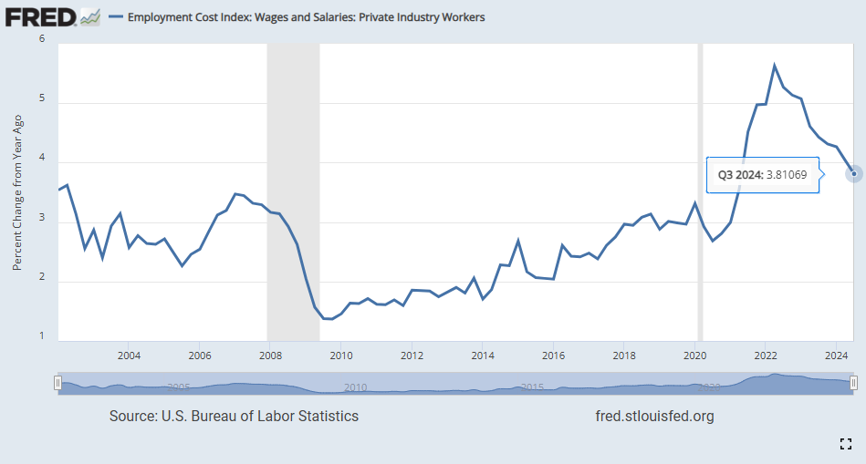
And hiring costs are slowing.
It seems to me that these signs all point towards a job market that is still strong but also adjusting to demographic and technologic changes.
In addition to payroll data, we also got some inflation data.
First up is the core PCE:
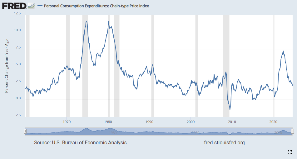
This is the Fed’s preferred inflation indicator. It has continued to move lower since it peaked in June of 2022. It is currently at 2.1% year-over-year, .1% over the Fed’s goal of 2%.
My preferred inflation indicator is the Case-Shiller home price index.
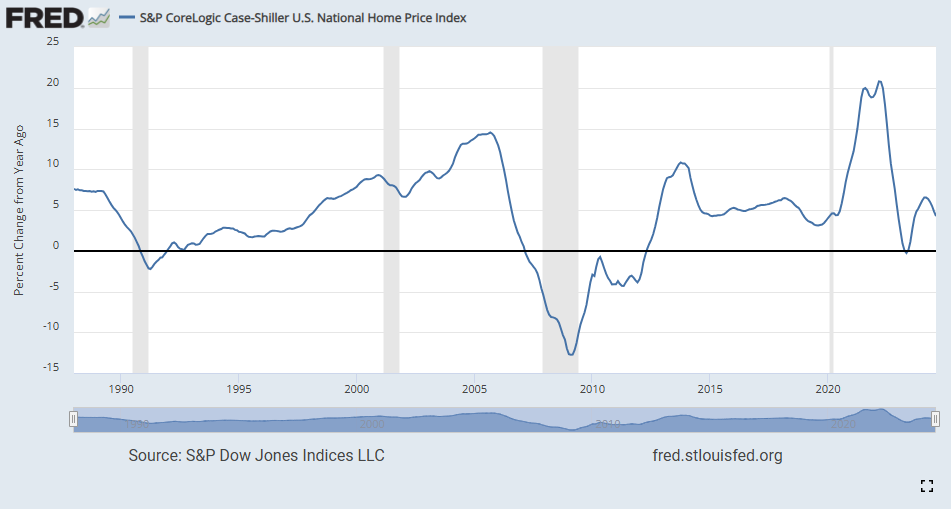
It is also showing that inflation is slowing. Real estate affordability has been stretched but signs are pointing to a market attempting to come back into balance.


I think these data points pave the way for another 25 basis point cut November 7th.
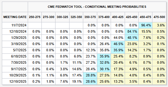
The market agrees giving a 96.4% chance of a 25 basis point cut at the upcoming meeting.
Recently market wizard Ed Yardeni shared a graph of the 10-year note yield change following the first rate cut in an easing cycle.

I decided to look and see what the performance was of the major indices after the rate cut on 6/7/1995.

It looks like tech broke out after the cut followed by small caps. It would have been nice to see something like SLYG (small cap growth ETF) and how it would have fared during this period.
This week’s python code is for the employment data. In the comments of the last post, Ryan suggested the Fred python wrapper fredapi, so I decided to give it a whirl.
#Import dependencies
!pip install fredapi
from fredapi import Fred
import pandas as pd
import matplotlib.pyplot as plt

#Fred API
fred = Fred(api_key='insert_your_api_key')

#Fetch data series
unemploy = fred.get_series('UNEMPLOY')
job_openings = fred.get_series('JTSJOL')

#Build DataFrame
df = pd.DataFrame({'UNEMPLOY': unemploy, 'JTSJOL': job_openings})

#Calculate ratio
df['Ratio'] = df['JTSJOL'] / df['UNEMPLOY']

#Remove rows with NaN values
df = df.dropna()

# Create the plot
plt.figure(figsize=(12, 6))
plt.plot(df.index, df['Ratio'])
plt.axhline(y=1, color='r', linestyle='--', label='1:1 Ratio')
plt.title('Ratio of Job Openings to Unemployed Persons')
plt.xlabel('Date')
plt.ylabel('Ratio')
plt.grid(True)
plt.gcf().autofmt_xdate()
plt.tight_layout()

# Save and Print the plot
plt.savefig('unemployment_to_job_openings_ratio.png')
print("Graph saved as unemployment_to_job_openings_ratio.png")
print(df['Ratio'].describe())

# Print Ratio
most_recent = df['Ratio'].iloc[-1]
most_recent_date = df.index[-1]
print(f"\nMost recent ratio ({most_recent_date.date()}): {most_recent:.2f}")
You’ll still need to sign up at the Fed’s Fred website for an api key. The wrapper doesn’t get you around that but it comes with many great features. Highly recommended.
I suggest passing your API key using the `FRED_API_KEY` environment variable or the `api_key_file` parameter. If you never put your credentials in source code, it's much less likely that you will accidentally publish your credentials to Substack.