

Margin Debt and the Yield Curve
a look at a couple of the market keys


FINRA put out the margin statistical data on Friday. In the report we saw another large decline in margin debt use. As a reminder, margin debt is when traders borrow money against their portfolio to buy more stocks. Its use by speculators can give a big boost to a bull market, however it can have the opposite result when its use declines.
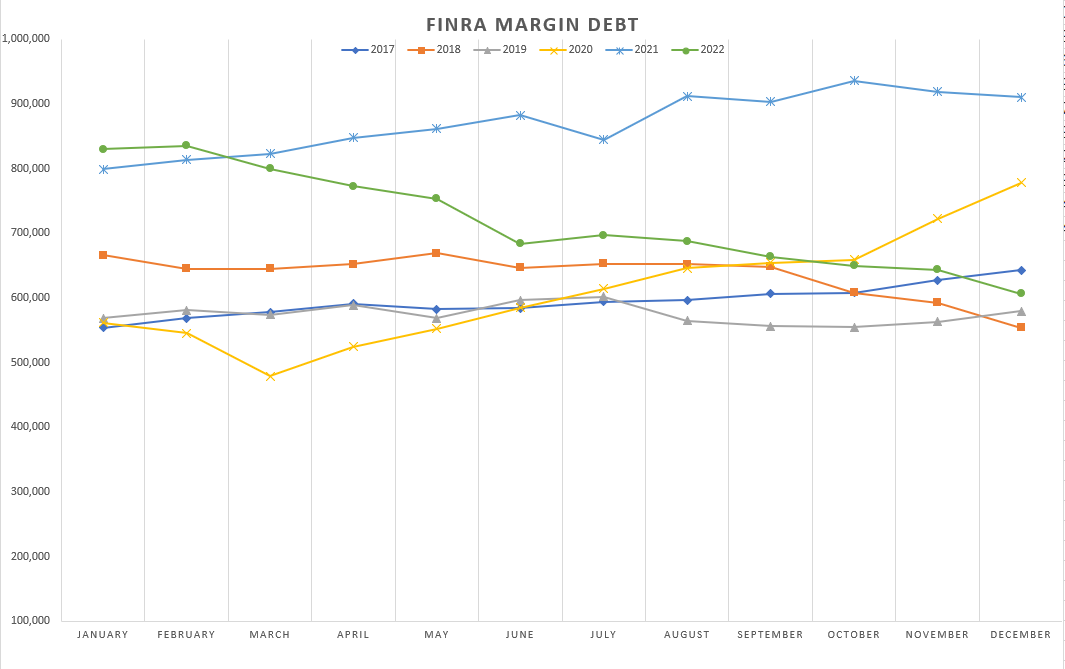
The above figures are in the millions of dollars. December saw customers reduce their Margin Debt by over $37B. This is the 2nd largest decline in 2022.
Market players have fallen back to margin debt levels of the pre-covid, pre-money pump era. It will be really interesting to see if Margin Debt continues to drop or stays flat here.
Free Credit Balance figures have leveled off. This is money that is considered “on the sidelines”. It is funds that customers are holding in their account and is available to purchase securities.

Again, the y-axis is in the millions of dollars. Free Credit Balance is all over the map here. I don’t believe that it is a good predictor of future outcomes like the Margin Debt is. When comparing this graph to the previous one, the Free Credit Balance is much higher than the pre-covid, pre-money pump era. This gives investors more cash to bid up stock prices when/if a turn in the fundamentals happens.
Next, a look at the yield curve. First up, the 10-2 year treasury spread.

This was by-far the most popular metric when anticipating a recession. As you can see, it has been a very good predictor. Something to keep in mind, the yield curve functions as a signaling mechanism. An inversion does not cause a recession. What it is signaling is that investors are bidding up the long-end of the curve (therefore forcing down rates and biding up bond prices). At the same time, the Fed is raising the Fed Funds Rate which is forcing up the short-end of the curve. Short-end up, long-end down = inversion.
The Fed had recently announced that they were watching the 10-year minus the 3-month yield as an indicator. This also is quite inverted.

In fact, it is the most inverted it has ever been.
Now I’ve gone ahead and taken this yield curve idea to the extreme by comparing the 30-year to the 3-mo.

It is quite something when you think about it. You are getting over 100 basis points to hold the shorter duration paper here. That is one extremely inverted curve. At some point either short-term rates are going to come down or long-term rates are coming up. In the past we can see that this has the ability to blow-out to 400 basis points to the upside. That would be a 500+ point swing from where we currently are.
For more info on the yield curve and inversions, Chris Waller at the Fed had this speech back in 2018.
Looking ahead, this week has the following data releases:
Tuesday - H.6 Money Stock Measures
Wednesday - Mortgage data
Thursday - Durable goods orders
Friday - Personal Income and Expenses, PCE Price Index
What extra do we get with a paid subscription?