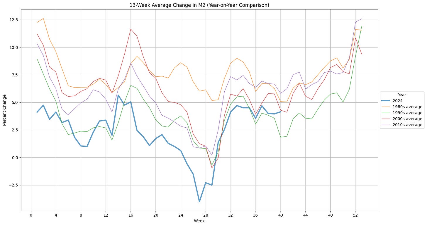
M2 data was released earlier in the week. It continues to grow at a 4.0% clip on a 13-week annualized basis. This is strong growth. Compared to previous decades’ averages it is back into the seasonal swing higher to end the year. It feels like the growth of the money supply could finish the year very strong and provide plenty of fuel for continuing the stock market boom.
This post is going to be short but I want to share a few things;
First, I’ve closed some positions and reduced others in an attempt to raise capital so that I can use more leverage. I feel strongly that the election outcome is holding back the stock market from really roaring and I want to have some cash to buy option contracts going into the end of the year.
Second, I’m going to be suspending the paid option for the blog soon. I don’t feel that I am able to put in enough time for a quality product. I’ve taken up other interests that have taken away time from the blog. The biggest of these is learning python.
I’ve been using my nascent python skills to automate a lot of the content that I was using to analyze the stock market. I intend to share these programs periodically. First up is my 13-week annualized M2NSA program. I used Google Colab and Claude.ai to build it. In order to execute this program on your own you’ll need to create a login on the Federal Reserve’s FRED website to get access to an api key to download the data.
import requests
import pandas as pd
import matplotlib.pyplot as plt
from datetime import datetime, timedelta

# Replace with your actual FRED API key
api_key = "replace_with_your_key"

# FRED series ID for M2 (Weekly, Not-Seasonally Adjusted)
series_id = "WM2NS"

# Calculate the date in years ago from today
end_date = datetime.now()
start_date = end_date - timedelta(days=50*365)

# Construct the API URL
url = f"https://api.stlouisfed.org/fred/series/observations?series_id={series_id}&api_key={api_key}&file_type=json&frequency=w&observation_start={start_date.date()}&observation_end={end_date.date()}"

# Make the API request
response = requests.get(url)
data = response.json()

# Extract dates and values
dates = [item['date'] for item in data['observations']]
values = [float(item['value']) for item in data['observations']]

# Create a DataFrame
df = pd.DataFrame({'Date': dates, 'M2': values})
df['Date'] = pd.to_datetime(df['Date'])
df.set_index('Date', inplace=True)
df['Week'] = df.index.isocalendar().week
df['Decade'] = (df.index.year // 10) * 10

# Calculate 13-week average change
df['13_week_change'] = (df['M2'] - df['M2'].shift(13)) / df['M2'].shift(13) * 400  # Percentage change

# Calculate decade averages
decade_averages = df.groupby(['Decade', 'Week'])['13_week_change'].mean().unstack()

# Create the plot
plt.figure(figsize=(15, 8))
for year in range(end_date.year - 0, end_date.year + 1):
    year_data = df[df.index.year == year]['13_week_change']
    plt.plot(year_data.index.isocalendar().week, year_data, label=str(year), linewidth=3, alpha=0.7)

# Plotting the Decade averages
decades_to_plot = [1980, 1990, 2000, 2010]
for decade in decades_to_plot:
  if decade in decade_averages.index:
    plt.plot(decade_averages.columns, decade_averages.loc[decade],
             label=f'{decade}s average', linewidth=1, alpha=0.8)


plt.title('13-Week Average Change in M2 (Year-on-Year Comparison)')
plt.xlabel('Week')
plt.ylabel('Percent Change')
plt.legend(title='Year', loc='center left', bbox_to_anchor=(1, 0.5))
plt.grid(True)
plt.xticks(range(0, 53, 4))

# Adjust layout to prevent cutoff of labels
plt.tight_layout()

# Save the plot as an image file
plt.savefig('m2_13week_avg_change.png')

print("Graph saved as m2_13week_avg_change.png")


grateful for your analysis
I did a quick search and found a Python client that someone wrote for the FRED API: https://github.com/mortada/fredapi