

Peter and the perpetually higher interest rate


The Producer Price Index was released today and showed a modest re-acceleration at 2.2% y/y.

To me, this doesn’t look like anything more than a return to the past trend. The average going back to 2010 is 2.6%. Prior to 2020, the PPI averaged a 1.7% y/y increase. 2.2% is all noise and no signal and now all eyes on now firmly on tomorrow’s CPI print for some kind of signal on where inflation could be going.
Looking at last month’s inflation reading, housing was the sticky point. BoAML titled their report, “Not encouraging”. What happens this month? “Still not encouraging”? The y/y heatmap shows the story:

Unfortunately the color coding is off. When things really heated up, everything went red. Now that these numbers are off their highs, we’ve gone green. The key is housing. Just look at those numbers:
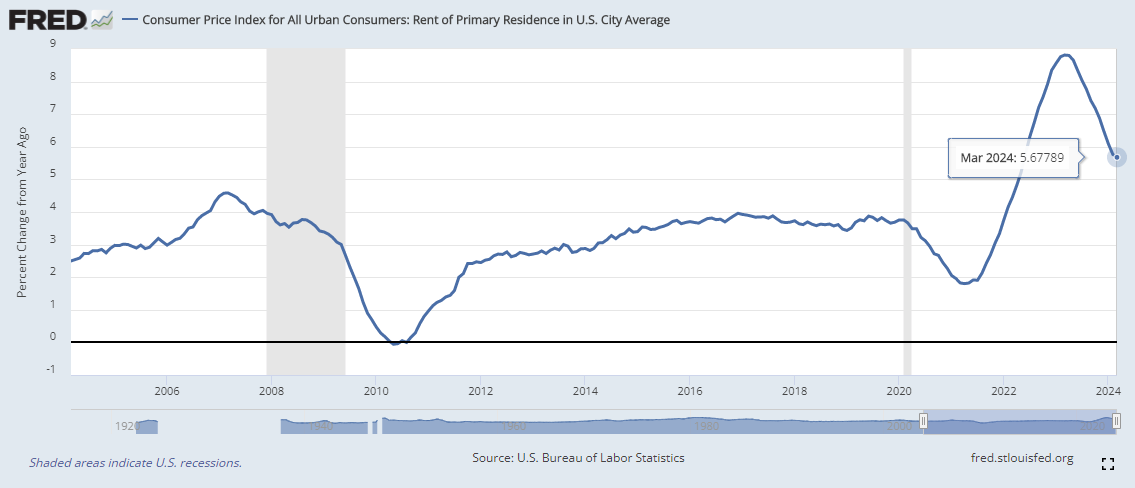
Shelter 5.65%
Owner Equivalent Rent 5.91%
Rent of Residence 5.68%
Ouch.
Does this graph look like it should be green to you?
My concern is that we have been under-developing residential real estate since the 1980s. Here is a look at active listings since 2016 from realtor.com’s research data.

Active listings have a seasonal pattern which peaks during the summer as real estate is highly seasonal. No one likes to move in the dead of winter. 2020 saw that pattern snap. We’ve moved down from 1-1.2M active listings to 500-750k. Simply put, people are not selling. They’ve locked in mortgages at below market rates and are hesitant to give those rates up.
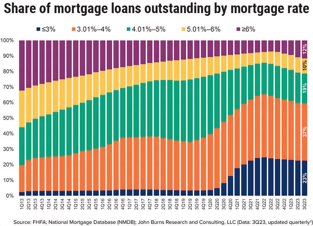
60% of outstanding mortgages have a rate at or below 4%. 79% are at or below 5%. This has added tremendous pressure on real estate services and shelter costs. What happens when there are 10 families and only 8 homes for sale? Answer, housing inflation stays sticky. Since shelter accounts for nearly 33% of the core cpi, expect tomorrow to show continued 3%+ inflation.
Peter Zeihan recently opined on this topic. His youtube video “Higher Interest Rates for Years” delved into the idea that demographics will play a hand in this as well.
For the past two weeks, I’ve fallen into a rabbit hole at the St Louis Fed’s website. I have grown obsessed with looking at old charts. Here is my current favorite.

This shows triple A rated bond yields since 1919. They bottomed at 2.46% in April of 1946 and then went on a 35 year run higher until peaking at 15.49% in September of 1981. Recently AAA rated bonds bottomed at 2.14% in July of 2020 after falling for 40 years. Could this cycle repeat? How long does the average person believe higher for longer might last? Another quarter? A year? I’m sure 25+ years is on no ones radar.
Finally, I’d be remiss if I didn’t mention two more happenings. First, the White House has announced a new round of tariffs on China.

This short-sighted move to intice hatred towards China will only hurt US domestic consumers with higher prices. This will be inflationary.
Second, everyone should give a warm welcome to Keith Gill, aka Roaring Kitty, on twitter. Keith had some great content on youtube and fell in with the GME crowd. He is a wallstreetbets crowd favorite. Since his return to twitter GME, AMC, and other shorted stocks have been bid higher. His twitter feed is full of cryptic meme tweets. I jumped on finviz and found the top 10 most short floated stocks in case we have another round of punishing short sellers.

I currently have no holdings in any of these and would consider purchasing any of these companies akin to buying a lottery ticket.
