

Employment and the rally that wasn't


Employment statistics came out this week and today saw the release of the unemployment rate, so I updated my labor chart:

We are currently looking at 1.14 jobs per unemployed person in the US. This is continuing to put upward pressure on wage rates, which are rising at a rate of 3.9% year-over-year.

This is well in excess of the previous decade average of 2.4%. Average hourly earnings of all private employees are up to $35.69 per hour.
I’ve been playing around with the Beveridge Curve. It measures the relationship between job openings and the unemployment rate.
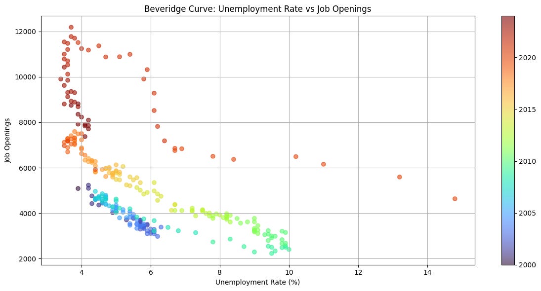
When the job openings number was released on Monday, I was able to accurately predict that the unemployment rate was going to be 4.1% by using the curve.
Looking at the curve you can see there is a relationship between the two sets of statistics, however it looks like it has evolved over the decades.

The Santa Rally came and went. It is measured as the last 5 days of the year plus the first 2 days of the next year. It is a highly reliable seasonal pattern that was first recorded in the Stock Trader’s Almanac in 1972. Since 1950 it has a historical performance average of 1.3%. I have the S&P500 down 0.53% over the rally time frame for ‘24/’25 which is highly disappointing.
Since 1950, December as a whole has an average return of 1.36%. I build this bell curve to display all Decembers since 1950 and their returns.

2024 is the red dot. As a whole, it was not a strong finish to the year.
Several ETFs peaked the week of Thanksgiving.

However I’m still optimistic because of the most recent margin debt statistics and the money supply data. So I plotted the return curve for Januarys since 1950.

January’s curve is not as symmetrical as December’s, though it is still skewed positive with a 1.02% average annual return.
I think the biggest thing weighing on markets right now is the adjustment to higher for longer as rate cut expectations are only pricing in 1 cut in 2025.
